Thinks
- What changed?
- What am I missing?
- Are there hidden fees?
T-Mobile
Redesigning T-Mobile’s digital and PDF bills to help customers understand their charges, reduce avoidable calls to Customer Care and make the experience more accessible at scale.
fewer billing calls per year
annual handling-cost reduction
reported bill comprehension
T-Mobile’s bill brings together plans, devices, services, credits and charges across an entire account. The challenge was to help customers understand what they owed, what had changed and what to do next.
I led the experience design across digital billing and PDF bill templates, connecting the information architecture, customer-facing explanations and production rules. The business objective was to reduce avoidable billing enquiries and build confidence in the bill.
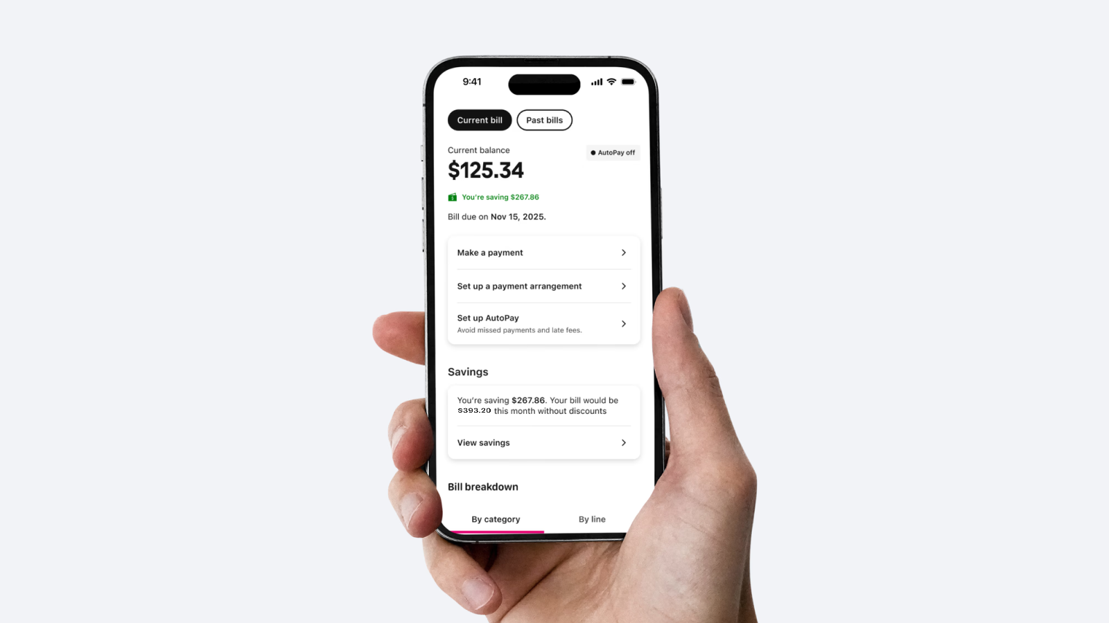
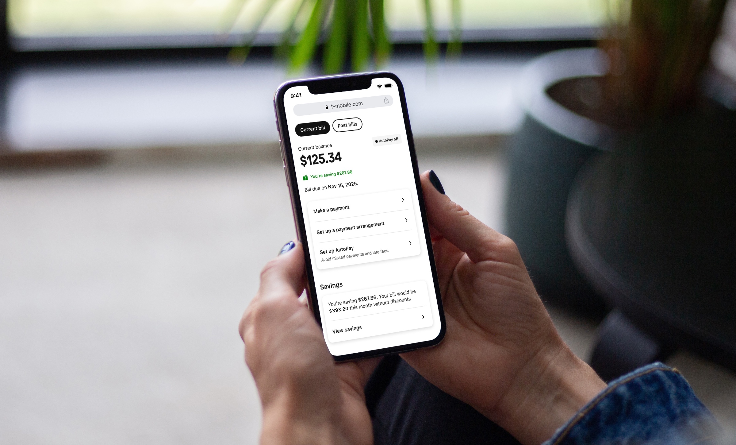
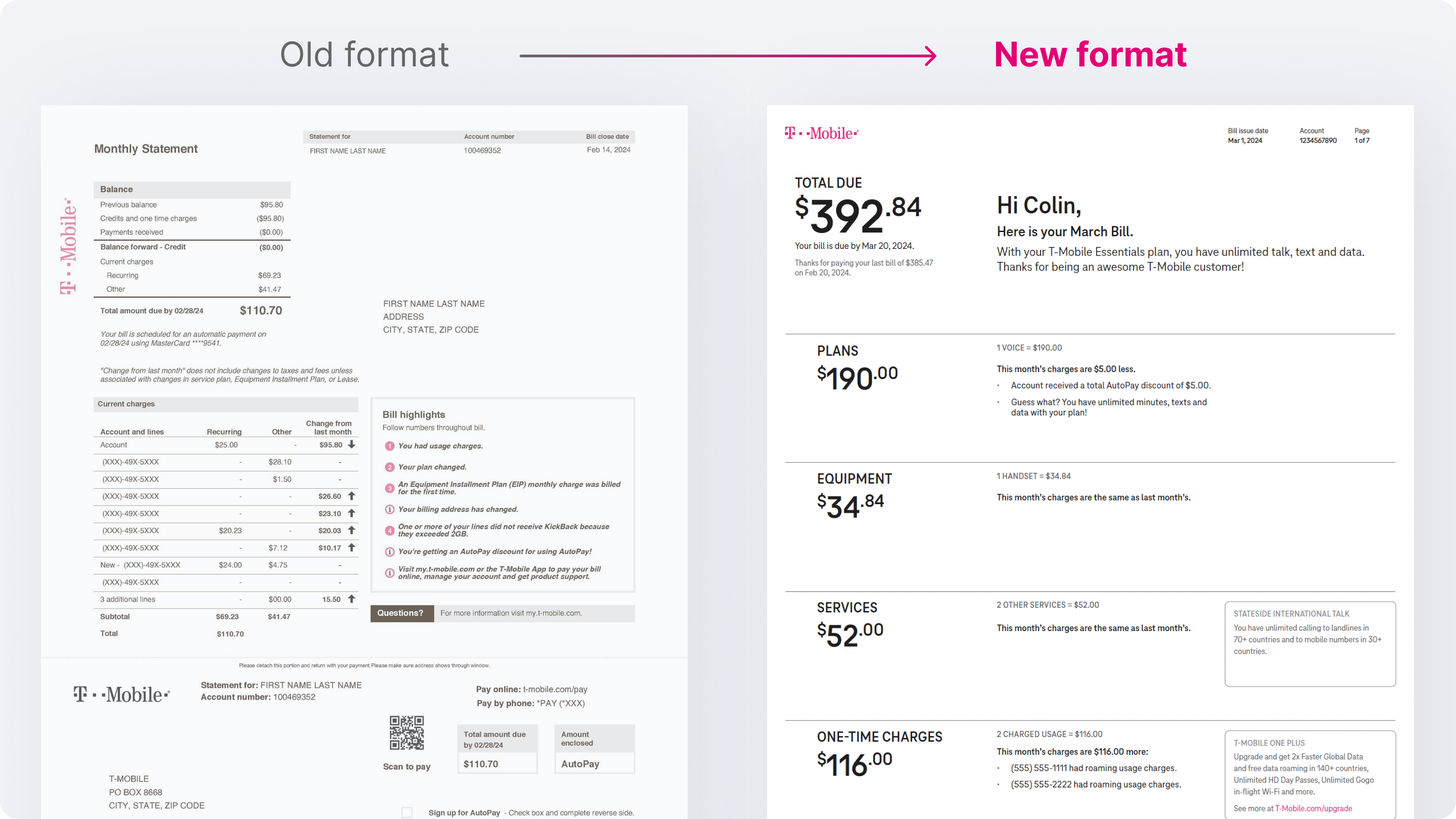
The digital experience lets customers move from an overview into more detail. The PDF follows the same underlying structure in a fixed document, with clear summaries, category breakdowns and contextual messages.
Review account activity, discounts and savings before exploring individual charges.
Follow the people on the account, or see where the money goes.
Payment options stay available from the bill overview.
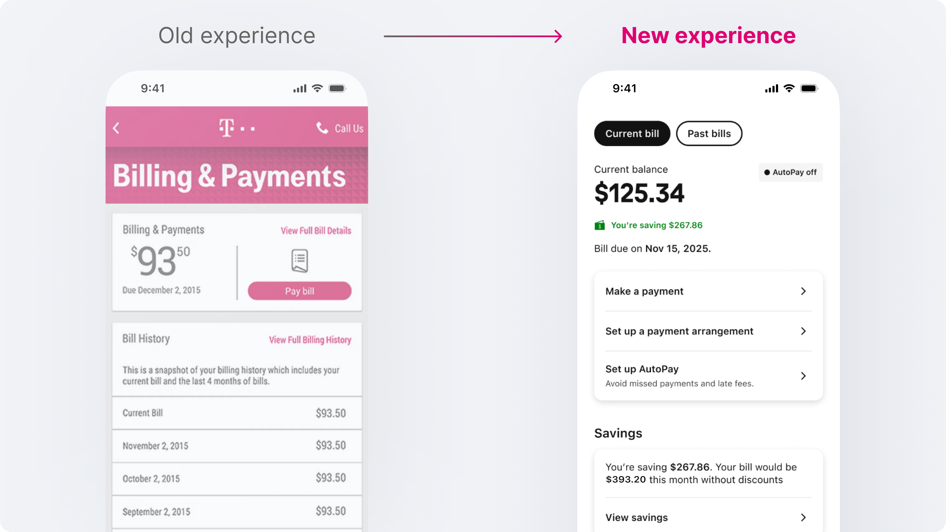
The earlier billing approach exposed the account’s complexity before explaining it. Customers had to connect totals, individual charges and account changes to understand why they were being asked to pay.
The redesign needed to answer those questions in a predictable order. First bills, overdue balances, credits and plan changes also needed explanations that matched the customer’s situation.
A digital screen could reveal detail progressively. The PDF had to maintain that clarity across columns and pages, including a meaningful reading order for assistive technology.
The templates and message rules had to cover the full billing lifecycle, including:
I owned the billing information hierarchy, navigation, explanatory messaging and translation between digital and PDF. I worked directly with T-Mobile’s bill architects and developers through specification, implementation questions and design QA.
My focus was the billing experience. The surrounding account-management interface and app navigation shown in some examples provide product context. T-Mobile stakeholders contributed the billing, brand, legal and accessibility requirements.
Three constraints shaped the work:
I worked from existing customer research and Customer Care insight, using the billing scenarios and account flows to turn recurring needs into design requirements. My contribution was to connect those inputs to the hierarchy, navigation and explanation rules across both formats.
Jordan brings those recurring needs together as a representative household-plan owner. The scenario makes the design priorities easier to follow.

Imagine opening your bill and seeing that the total has changed. You want to know what you owe, when it’s due and what made this bill different.
Existing customer research and insight from Customer Care helped me put those questions in order. I made the amount due and due date the starting point in both formats, then placed explanations beside the charges they relate to.
In the examples below, annotation 1 shows where the balance and due date appear on the Digital and Paper tabs. On Paper, annotation 3 shows how the PDF explains a change beside the affected charge.
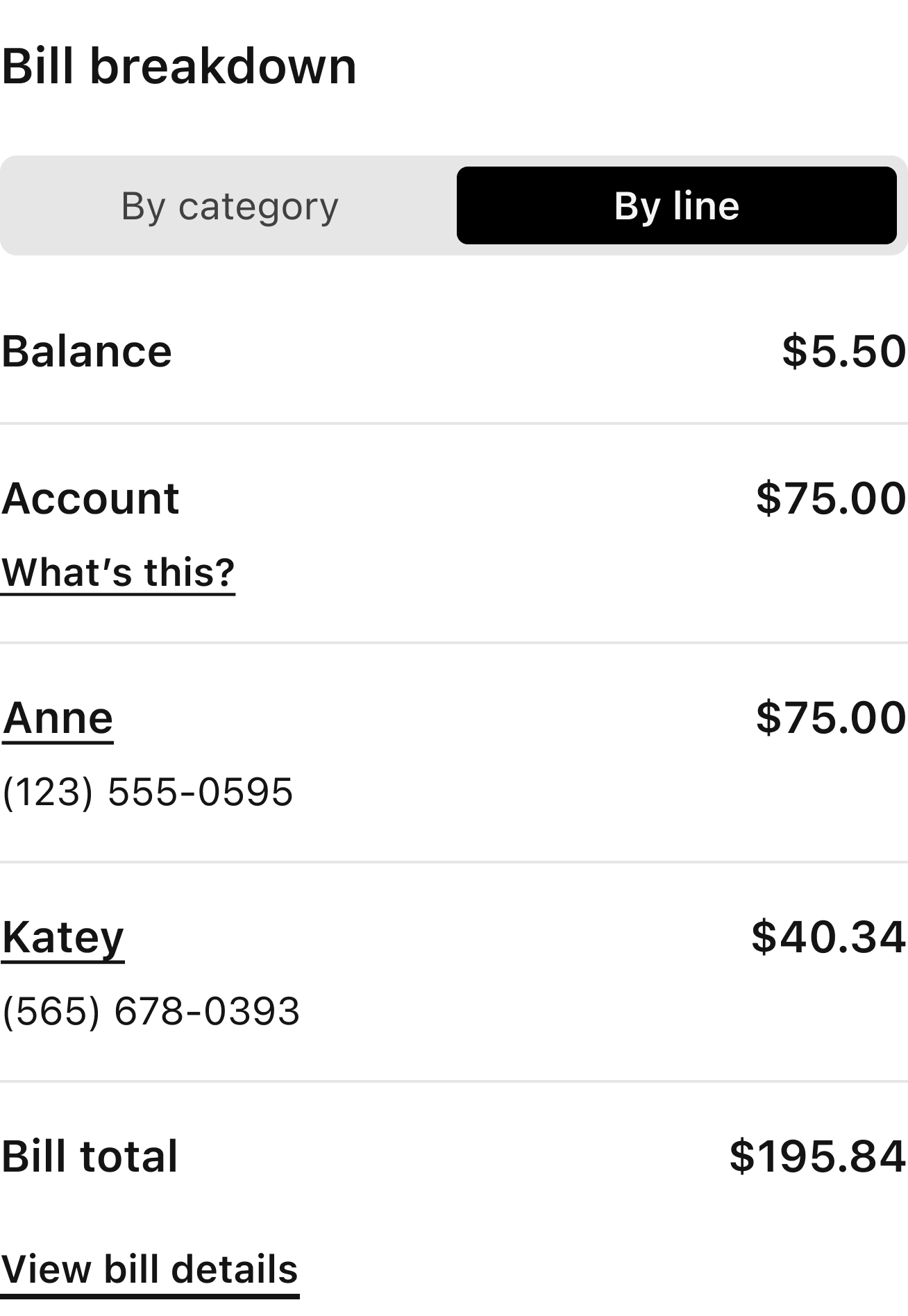
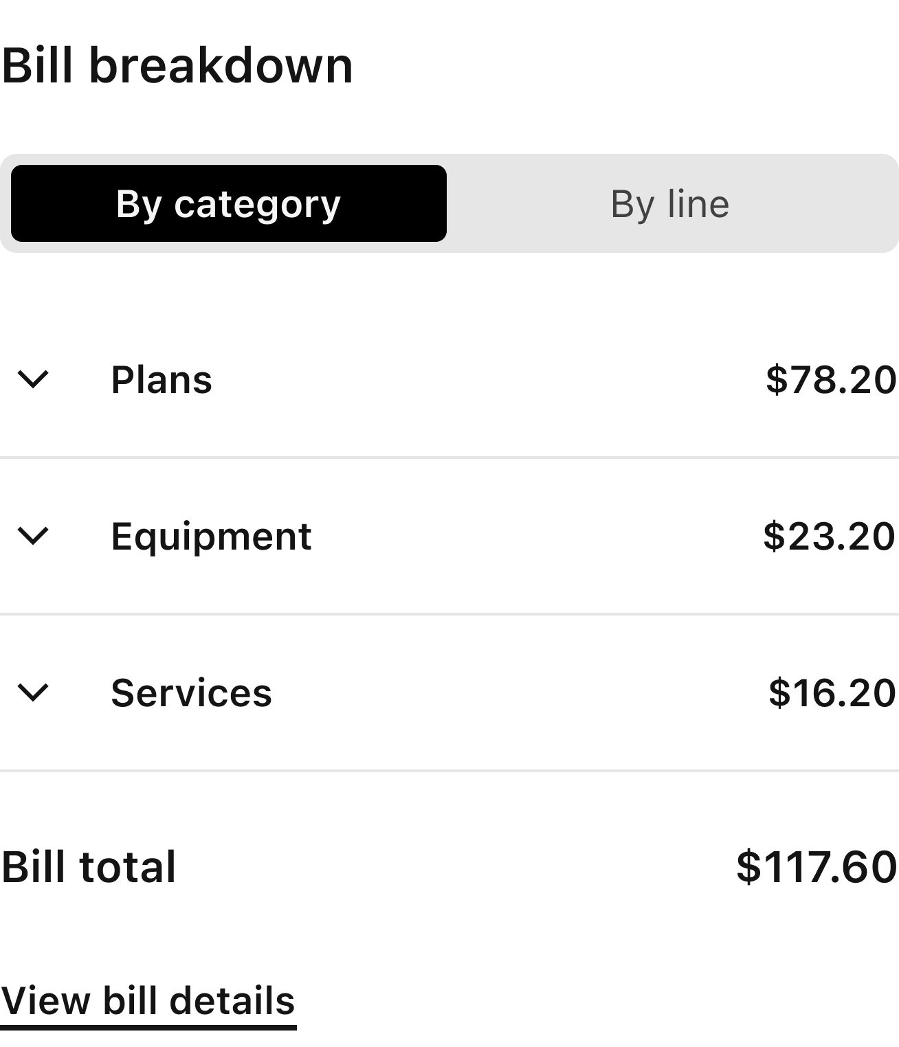
Some customers think about the people and devices on their account; others think about plans, equipment and services.
I kept both line and category routes into the same charges. This gave Customer Care and customers shared reference points without changing the underlying totals.
Proximity and indentation can connect information visually, but those relationships also need to work in a fixed document and a logical reading sequence.
I treated headings, section names, grouped charges and message placement as structural decisions. PDF production guidance needed to describe how content should flow as well as where it should appear.
A single, category-first breakdown would not suit every customer. Creating unrelated line and category experiences would introduce competing hierarchies and increase the risk of inconsistent totals.
I kept two routes into one billing structure: by line for people and devices, and by category for types of spending. Shared section names, totals and charge relationships carried through to the PDF, arranged as summaries and detailed tables.
Supporting both routes added navigation and specification work. I accepted that complexity in the template rules so customers could use the view that made sense to them.
The bill could support different ways of investigating charges while retaining one consistent account structure.
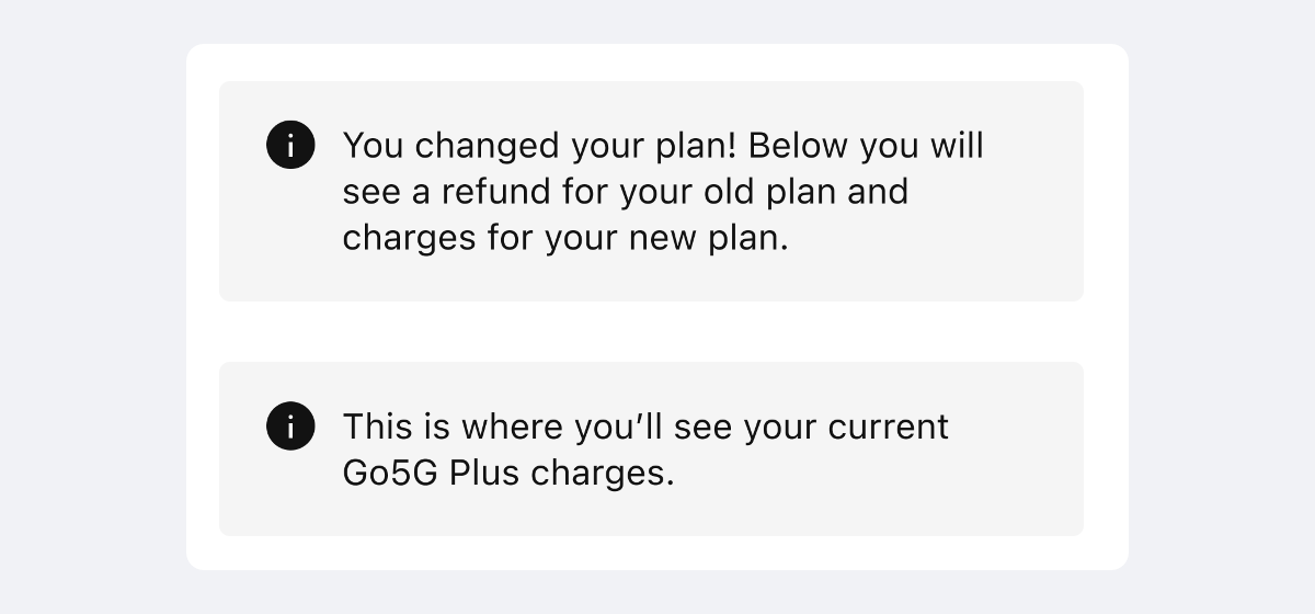
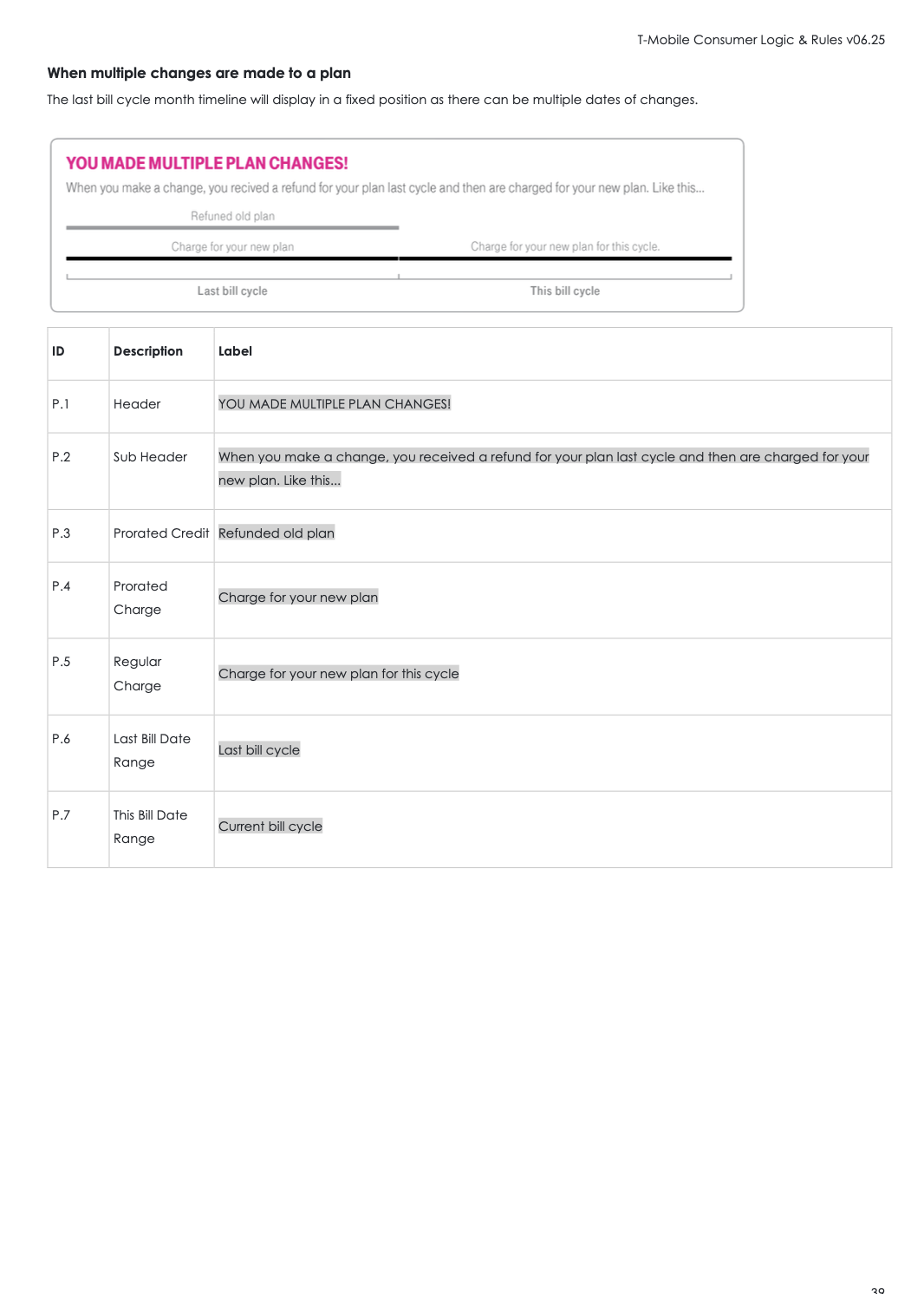
A plan change can create a refund and a new charge on the same bill. Showing the transactions without their relationship leaves the customer to explain the difference.
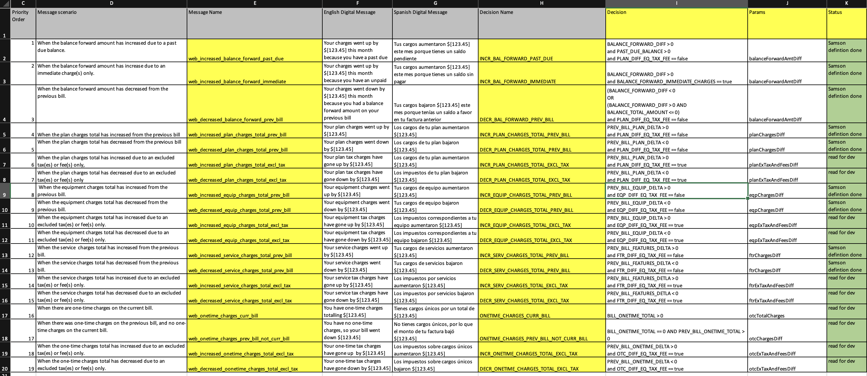
I placed scenario-specific explanations beside the affected category, distinguishing account activity, mid-cycle changes and regular charges. The same message logic carried into the PDF, with presentation adapted to its fixed layout.
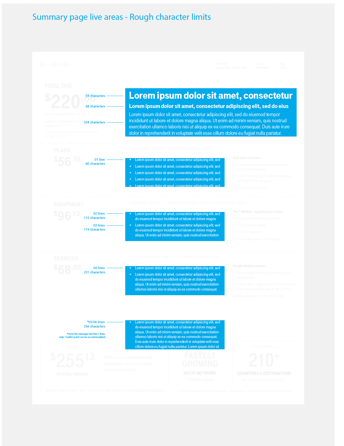
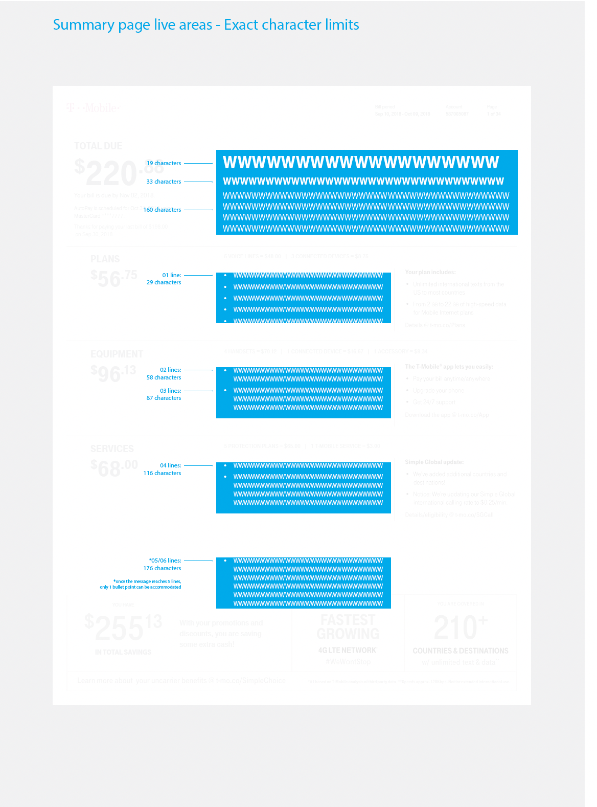
Every explanation takes space. I prioritised messages by relevance and defined content limits so unusual scenarios could be explained without overwhelming a routine bill.
Customers were given an explanation of the account event before being asked to interpret its individual charges.
A polished template could still fail when a message was too long, several conditions applied together or content crossed a page boundary.
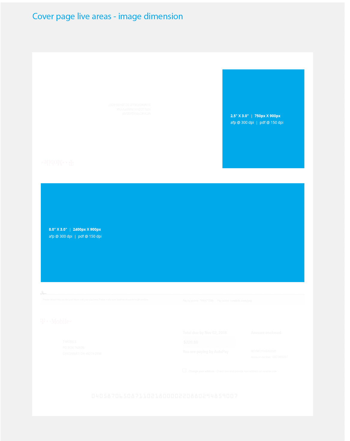
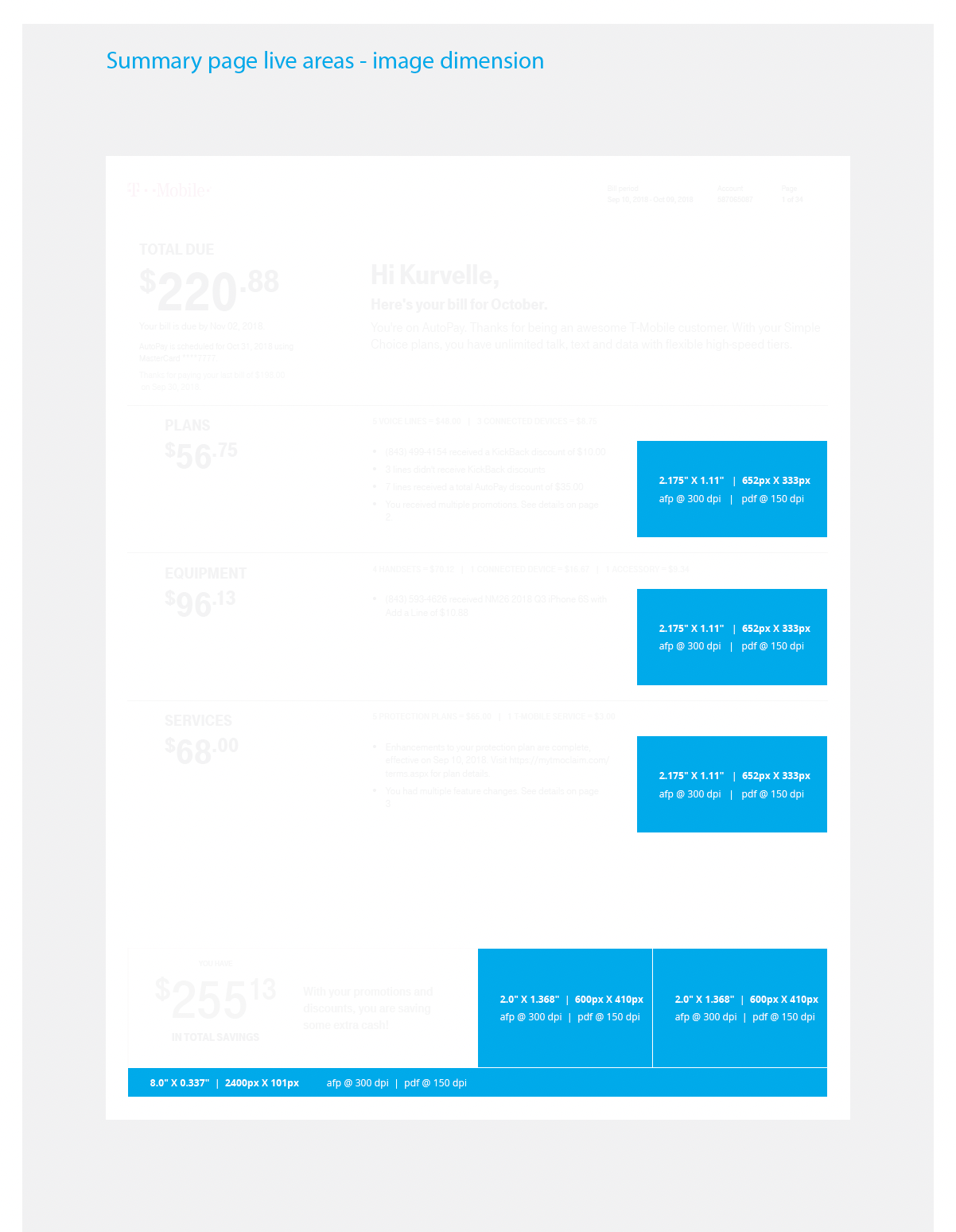
I worked with bill architects and developers to document the layout, data dependencies, display rules, message priorities and content limits together. Live areas were defined for contextual service and promotional content, with billing information taking priority.
This required a more detailed handoff and review across teams. Resolving those conditions in the specification gave implementation and QA a shared reference.
The handoff described how the bill should behave across scenarios, as well as how it should look. The original artifacts below show the layout limits, field rules and messaging decisions.
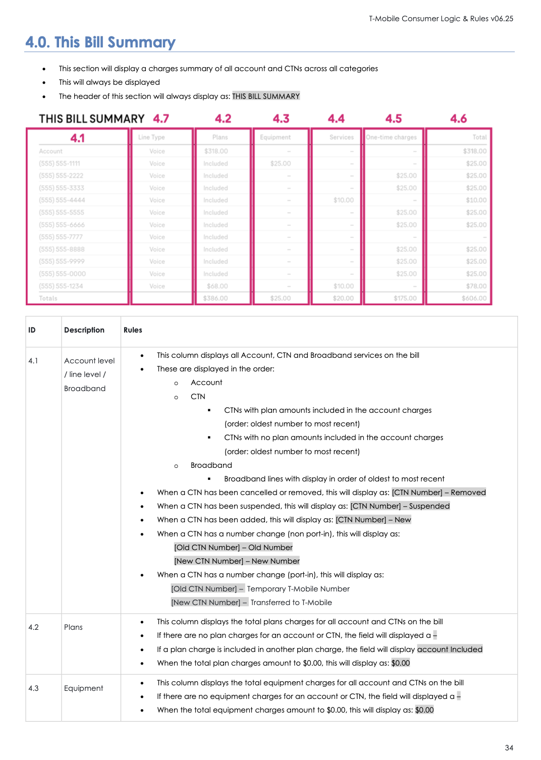
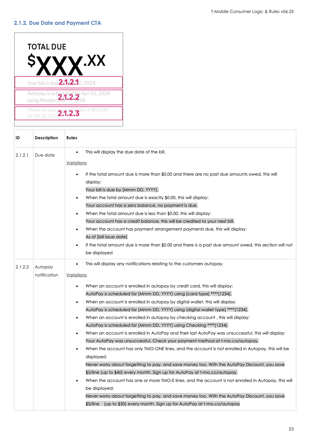
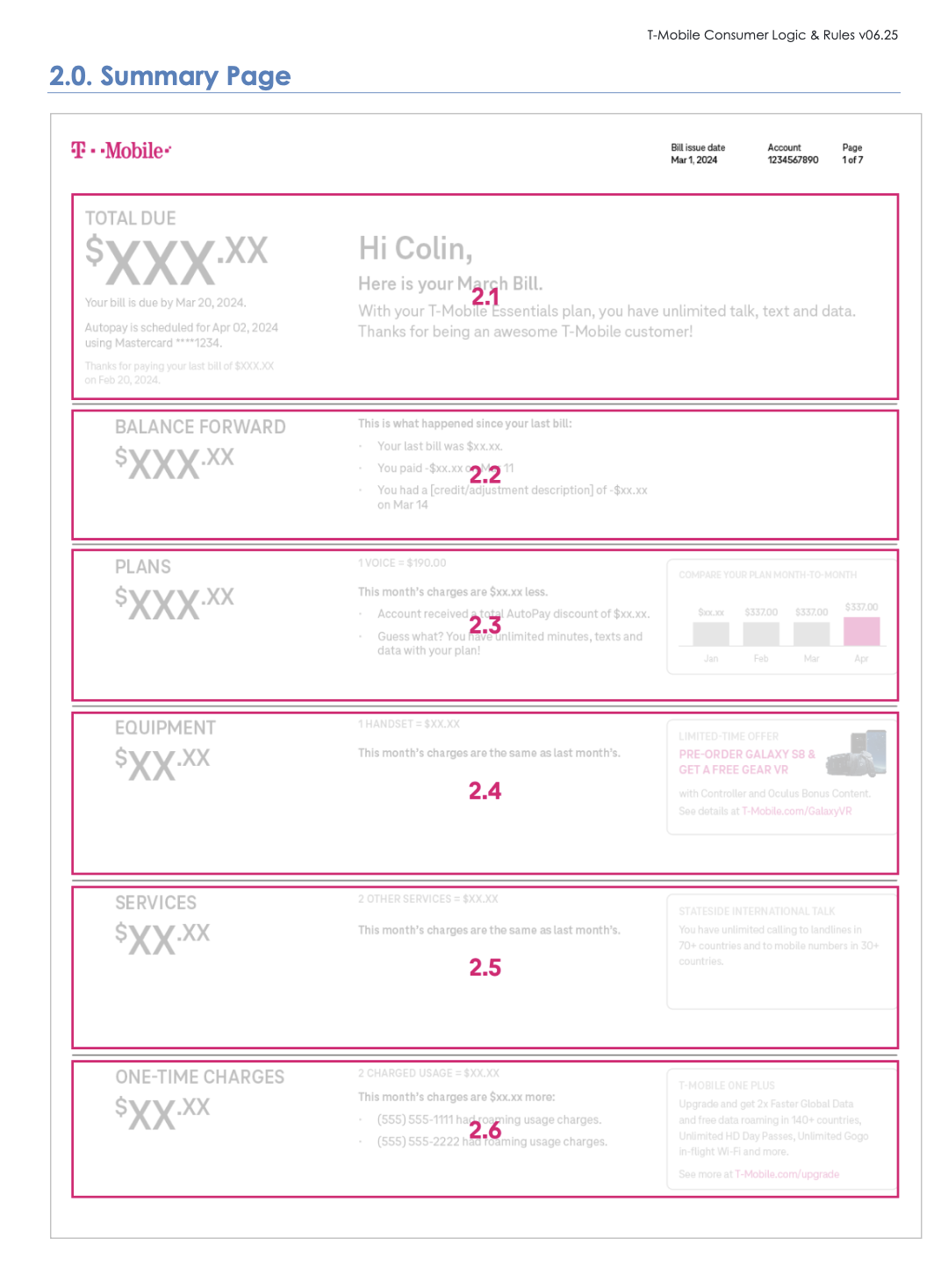
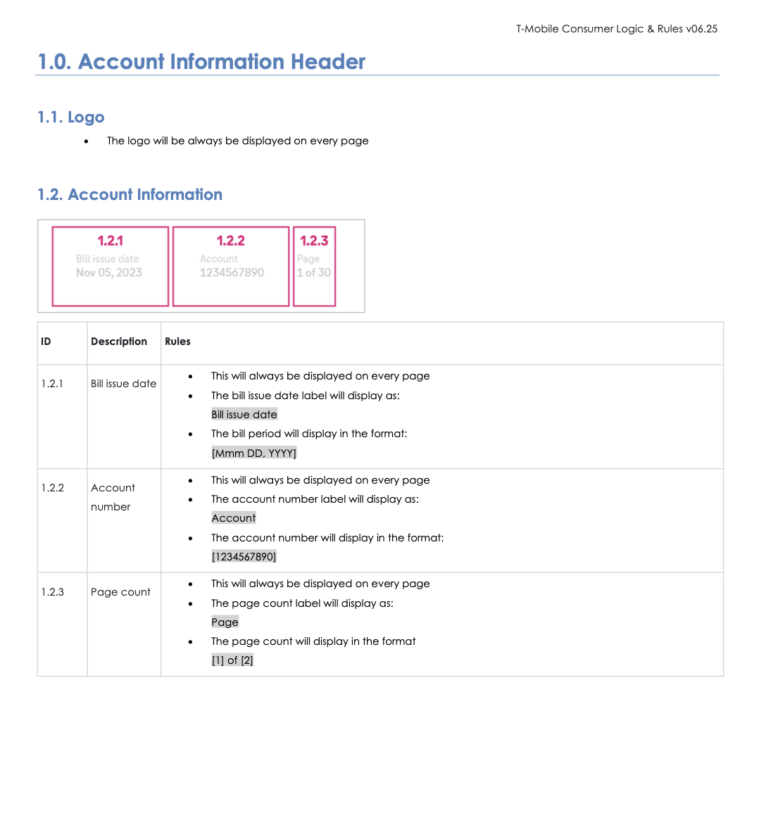
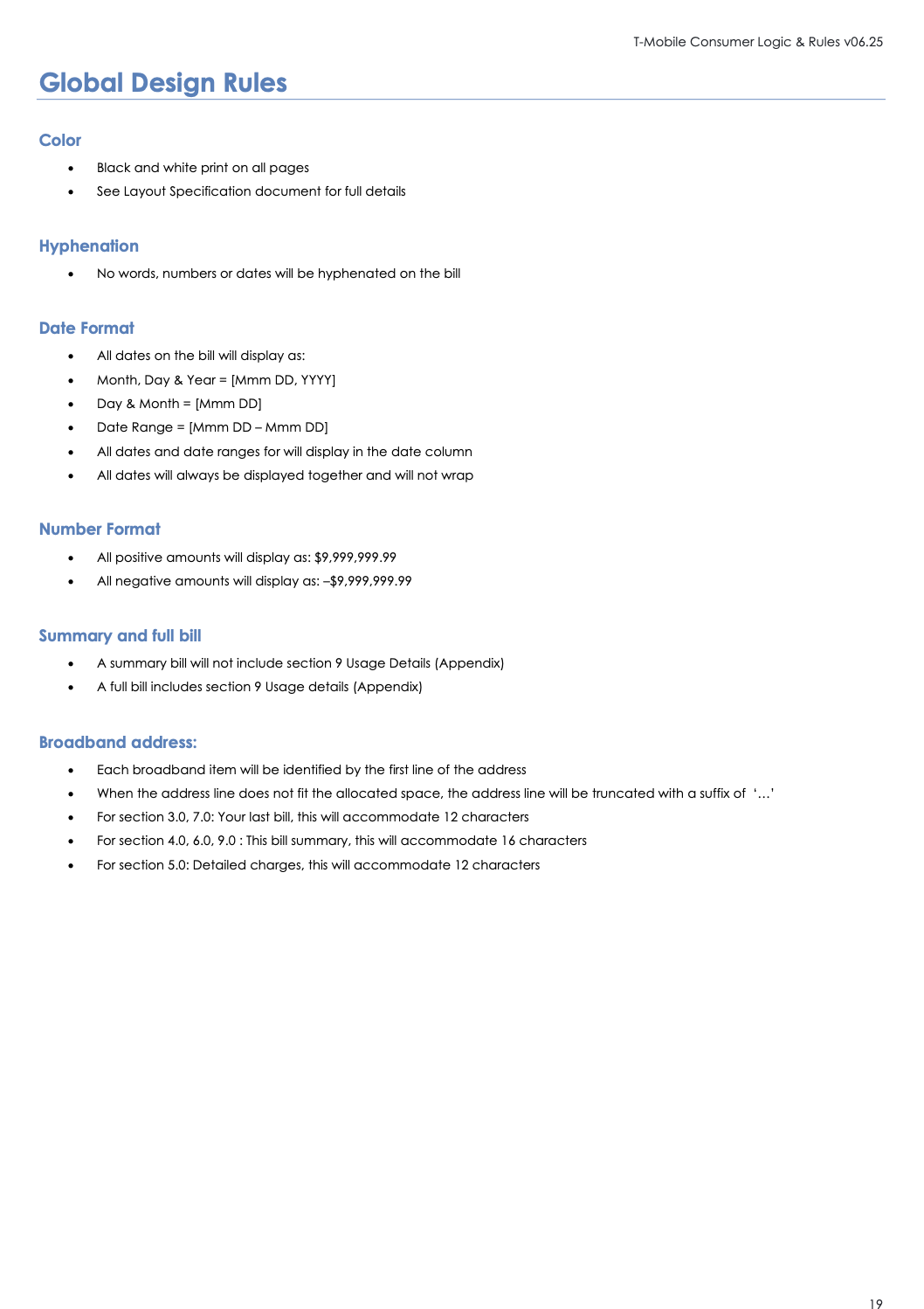
The final design connects a clear bill overview with detailed charges and past bills. Digital screens support exploration; the PDF brings the same information into a structured document.
The examples below show the billing work in context. Customer details, amounts and dates are sample data.
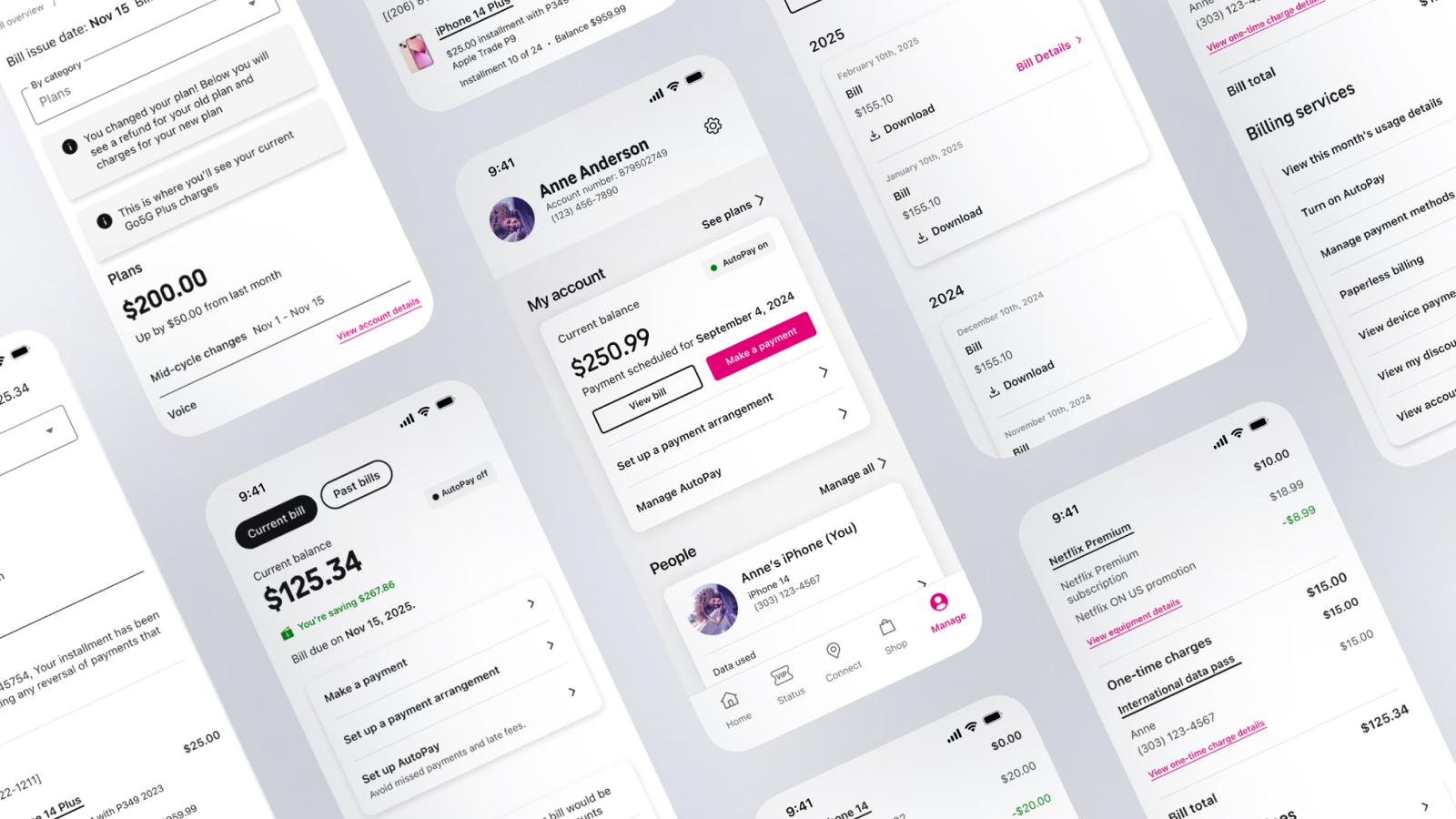
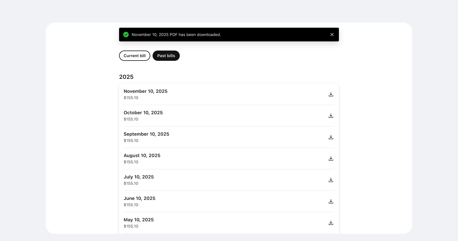
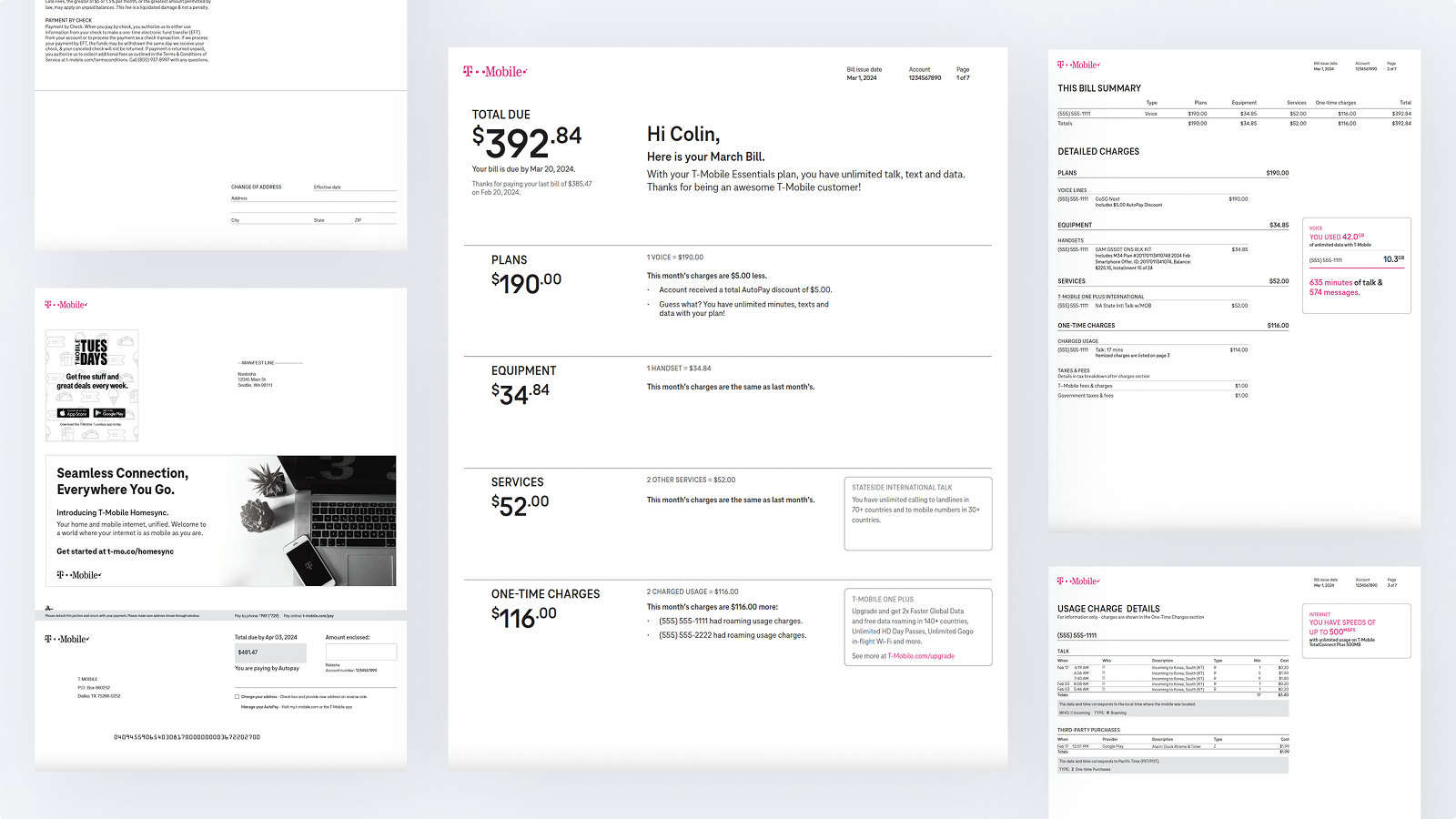
The redesigned bill brought a shared structure to digital and PDF, with clearer totals, contextual explanations, visible savings and consistent ways to explore charges. The layout, logic and messaging specifications gave production teams a shared reference for handling varied account data.
120k
~$960k
78%
This project showed how closely a bill’s layout depends on its data, logic, language, accessibility and production rules. At T-Mobile’s scale, a rare edge case can still affect many customers.
Digital and PDF bills needed a shared structure, with each format using its own strengths. Defining headings, labels and a logical reading order made the relationships between charges explicit across both formats.
The lasting value was a set of templates and rules that could turn varied billing data into an experience customers could understand and act on, while supporting relevant service and commercial messages.