Thinks
- Can I ask for a quick explanation?
- Will this change happen again?
- What will the assistant do next?
Norlys
From static bills to AI-guided conversations. A digital bill concept that explores how AI could make everyday billing more convenient while keeping customers in control.
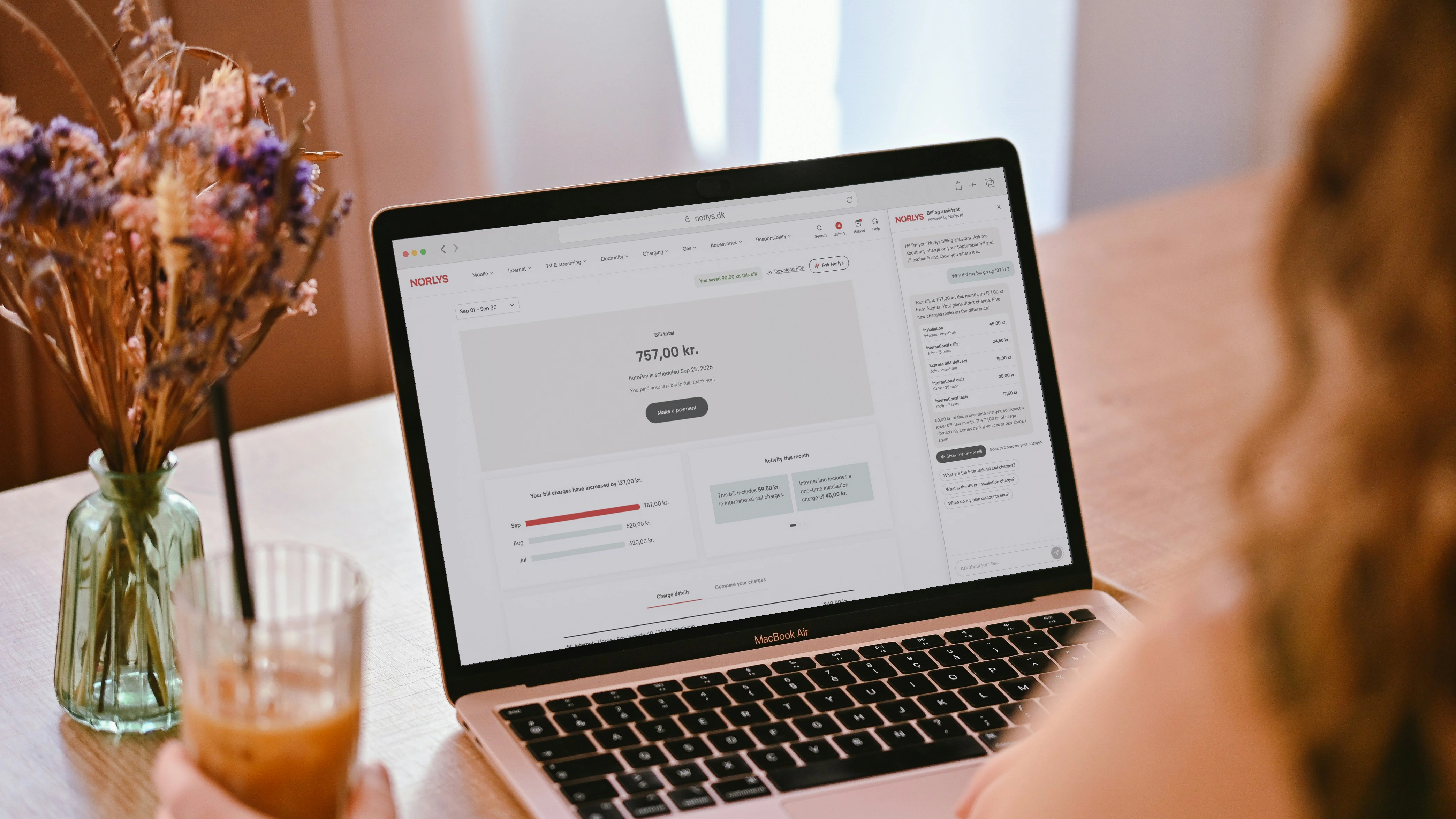
complete digital bill concept, designed from scratch
months to design and develop the sales concept
ways to explore: browse the bill or ask the assistant
What could a digital bill become when customers can talk to it?
Norlys did not have a digital bill at the time of this concept. The work started from scratch: a complete desktop and mobile billing experience, from the summary and payment information through to charge comparisons and detailed usage.
Within that experience, AI offered another way to explore the bill. Customers could continue using a clear, structured interface, or ask a question and let the assistant bring the relevant information together.
The concept looked ahead to a more conversational billing experience. It made that future tangible for Norlys, connecting the bill design with an assistant that could explain, guide and respond in context.
A well-designed bill already makes its information easy to find. AI offers the convenience of asking for what you need.
A customer may want a quick explanation, a comparison with last month or a closer look at their usage. Conversation creates an optional route through those tasks, alongside the bill's existing navigation.
The design challenge was to make that help feel natural. The assistant needed to understand the context, offer useful next steps and support the customer's pace.
Sofia manages her household’s mobile and internet services. She is comfortable using digital services and wants routine billing tasks to take little time. Sometimes she prefers to browse the bill; sometimes asking a direct question is more convenient.
This representative scenario focuses the design on choice: useful guidance when she wants it, familiar navigation when she does not, and a clear way back after exploring.

As lead designer, I shaped the complete digital bill concept with the Amdocs Bill Experience Team over three months.
The work combined information hierarchy, billing UI and conversational interaction. The AI exploration focused on how an assistant could make the experience more convenient while keeping the customer in control.
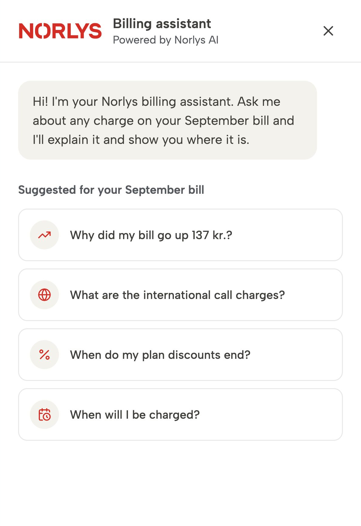
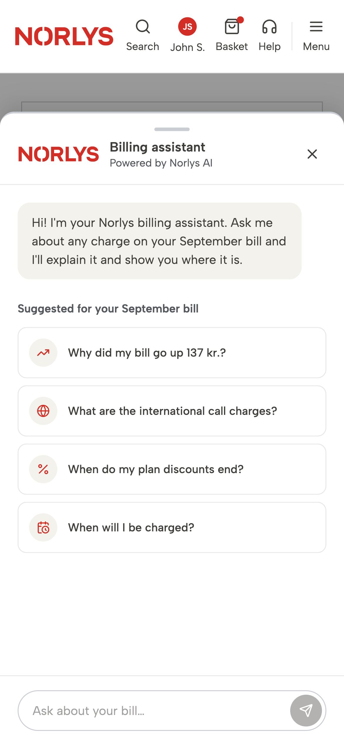
An empty chat box asks the customer to work out what an assistant can do. Contextual questions make that offer more concrete.
Suggested questions reflect the bill in front of the customer. They make the assistant's capabilities understandable without asking someone to learn a new interaction model first.
Customers can also type a question. Follow-up suggestions keep related information within reach as the conversation develops.
The earlier interaction moved the bill automatically when the assistant answered. It demonstrated the capability, but introduced a UX problem: an unexpected change could feel as though something else had taken control of the screen.
Design review shifted the question from what the assistant could do to when it should act. Asking for an explanation did not necessarily mean asking the page to move.
Slowing the movement would not resolve that distinction. Confirmation popups and countdowns added interruption, while a moving cursor reinforced the feeling of someone else controlling the interface.
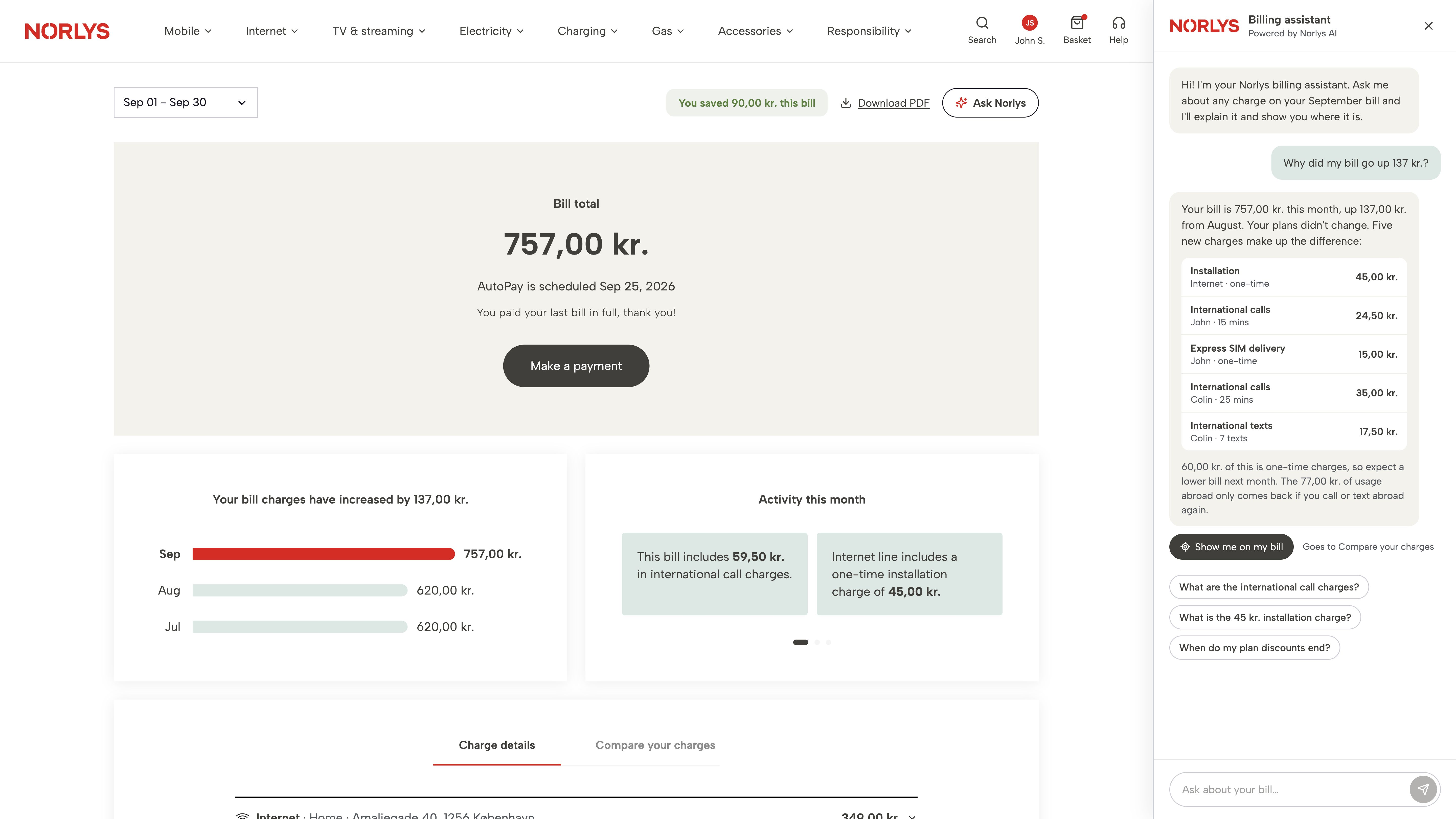
The chosen approach separated the explanation from the action. The assistant offered a clear chat CTA, named the destination and waited for the customer to choose. Guidance then became an intentional next step, with a route back afterwards.
Accessibility guidance reinforced the importance of predictable changes and customer control. A clear action, advance announcement and route back made that intent part of the interface.
Early interaction thinking
Before defining the screens, I explored when an AI explanation should become an action. Could automatic movement feel like someone else taking control? Asking for an explanation doesn’t necessarily mean asking the page to move.
Decision 01
The assistant was designed as another way to use the billing experience. Its answers remained connected to the interface, rather than becoming a separate destination.
Explanations could bring related information together, while a clear action offered a route to the supporting detail. Keeping the conversation and bill in view helped preserve context between the question, the answer and the next step.
This made AI useful beyond generating text. It could help customers move through the experience in a way that followed their intent.
Decision 02
An explanation and a request to navigate are different things. Moving the page as soon as an answer appears risks pulling attention away while the customer is still reading.
The chosen pattern gives each step a clear purpose: offer, announce, move, label and return.
The CTA makes the next action explicit. An announcement prepares the customer for the change, a visual label explains the new view and a return control preserves their place.
The interaction makes assistance a choice the customer can follow, interrupt and reverse.
Select a step to explore the interaction.
A clear action separates asking for an explanation from choosing to navigate.
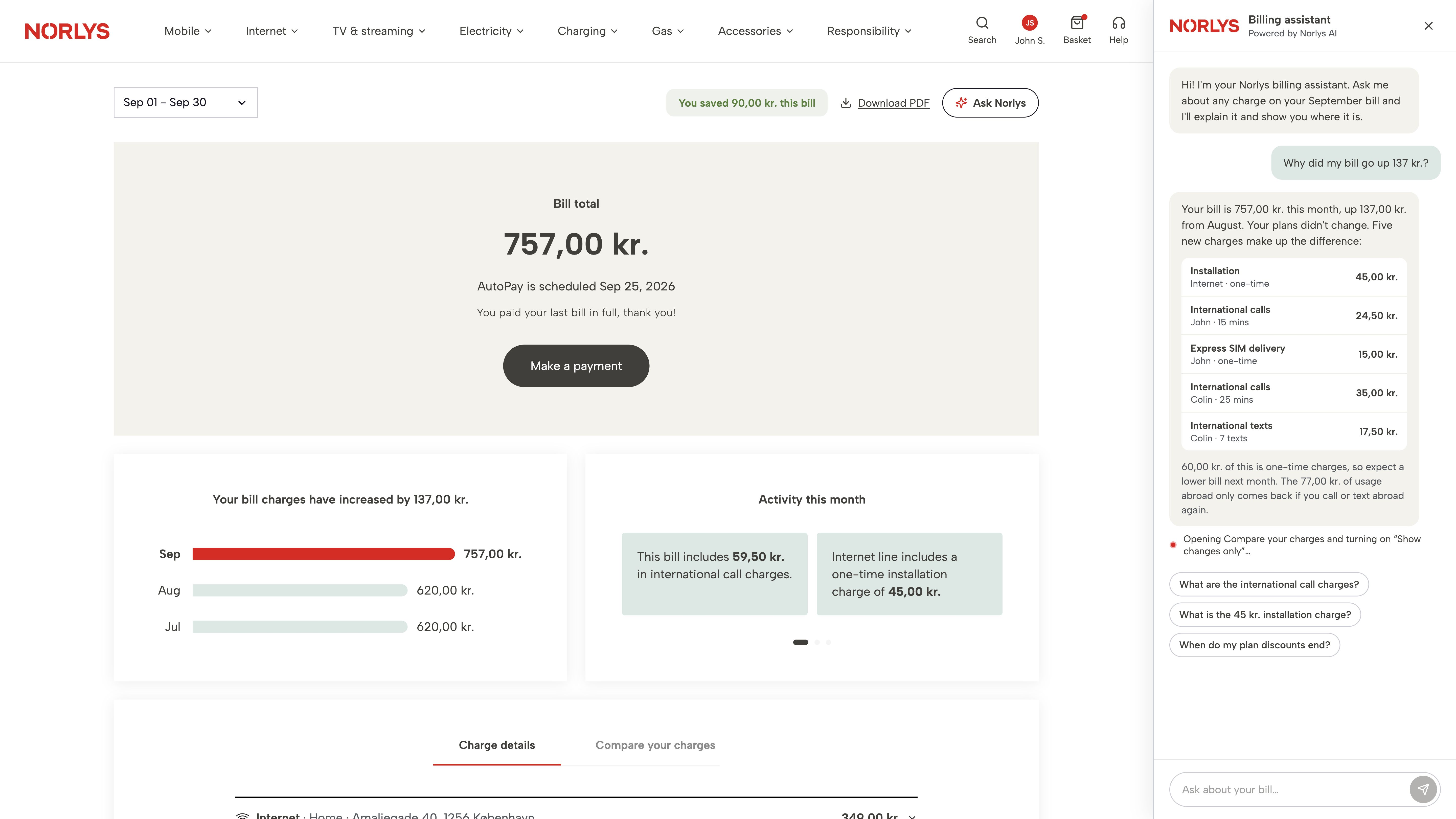
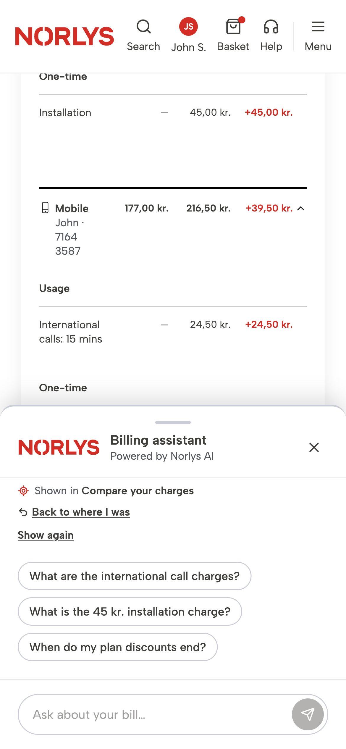
The assistant names the destination and the filter change before moving the bill.
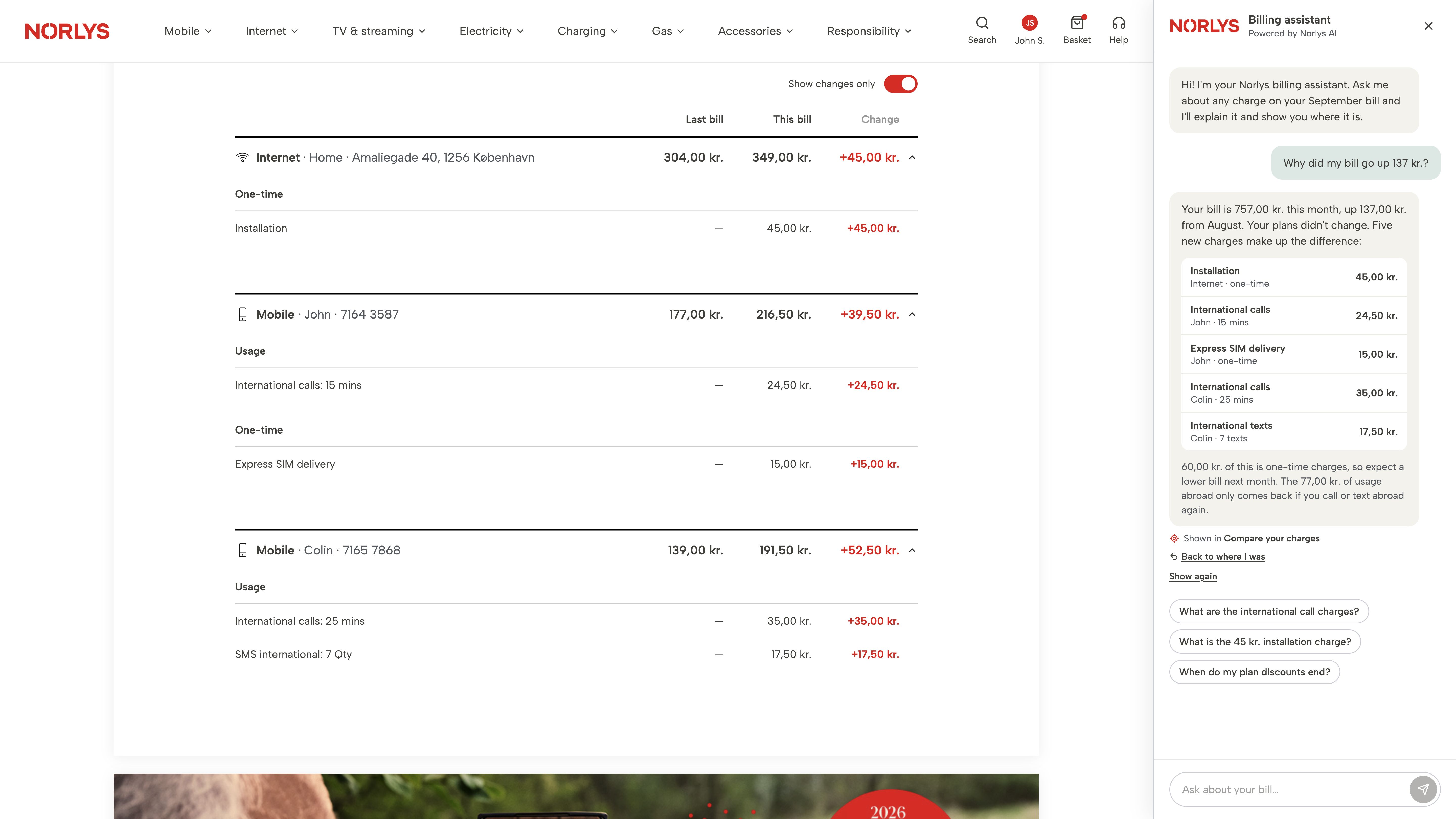
The comparison opens with changed charges in view. The conversation stays alongside it.
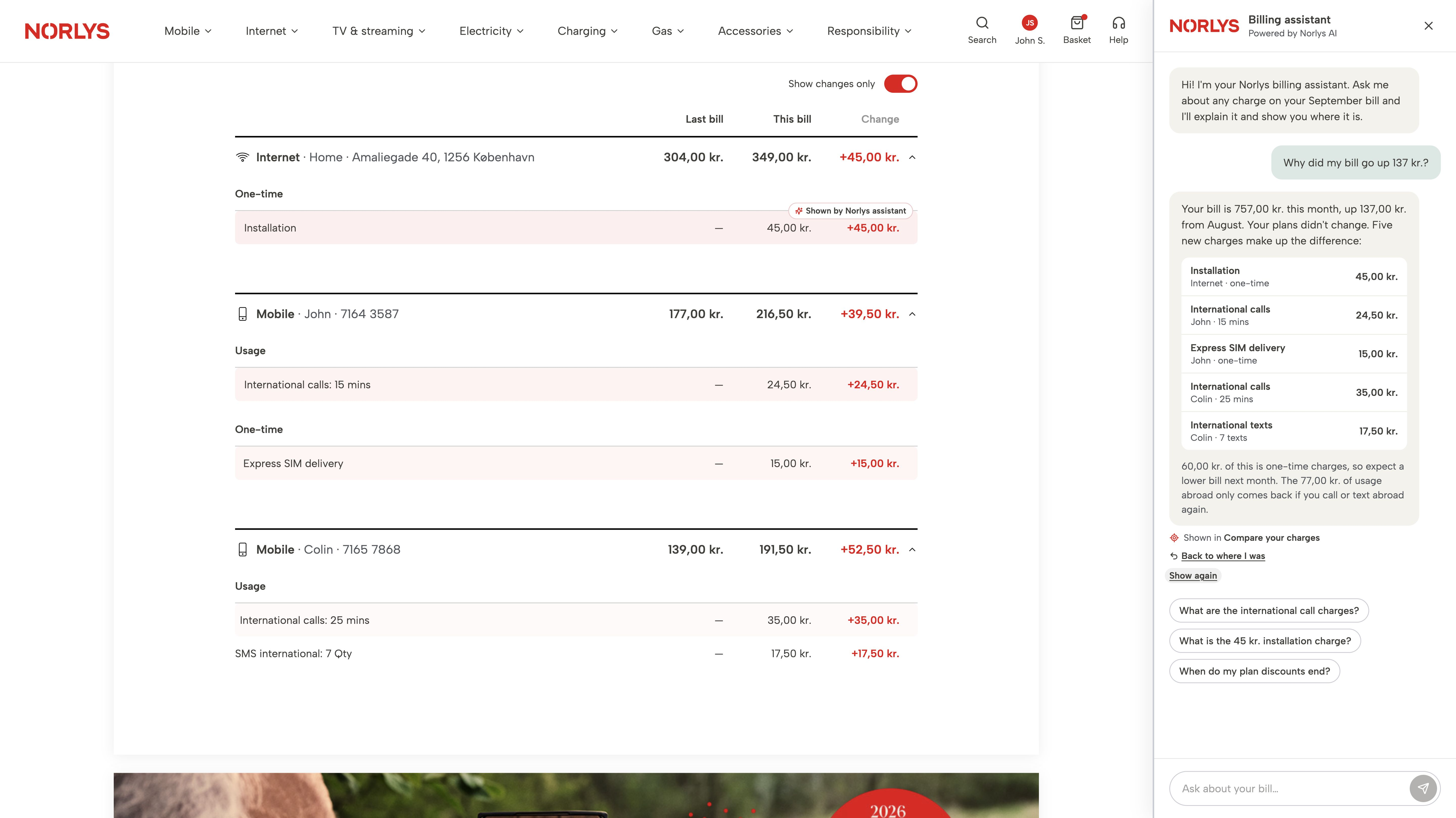
A soft tint and label connect the explanation to the relevant charges.
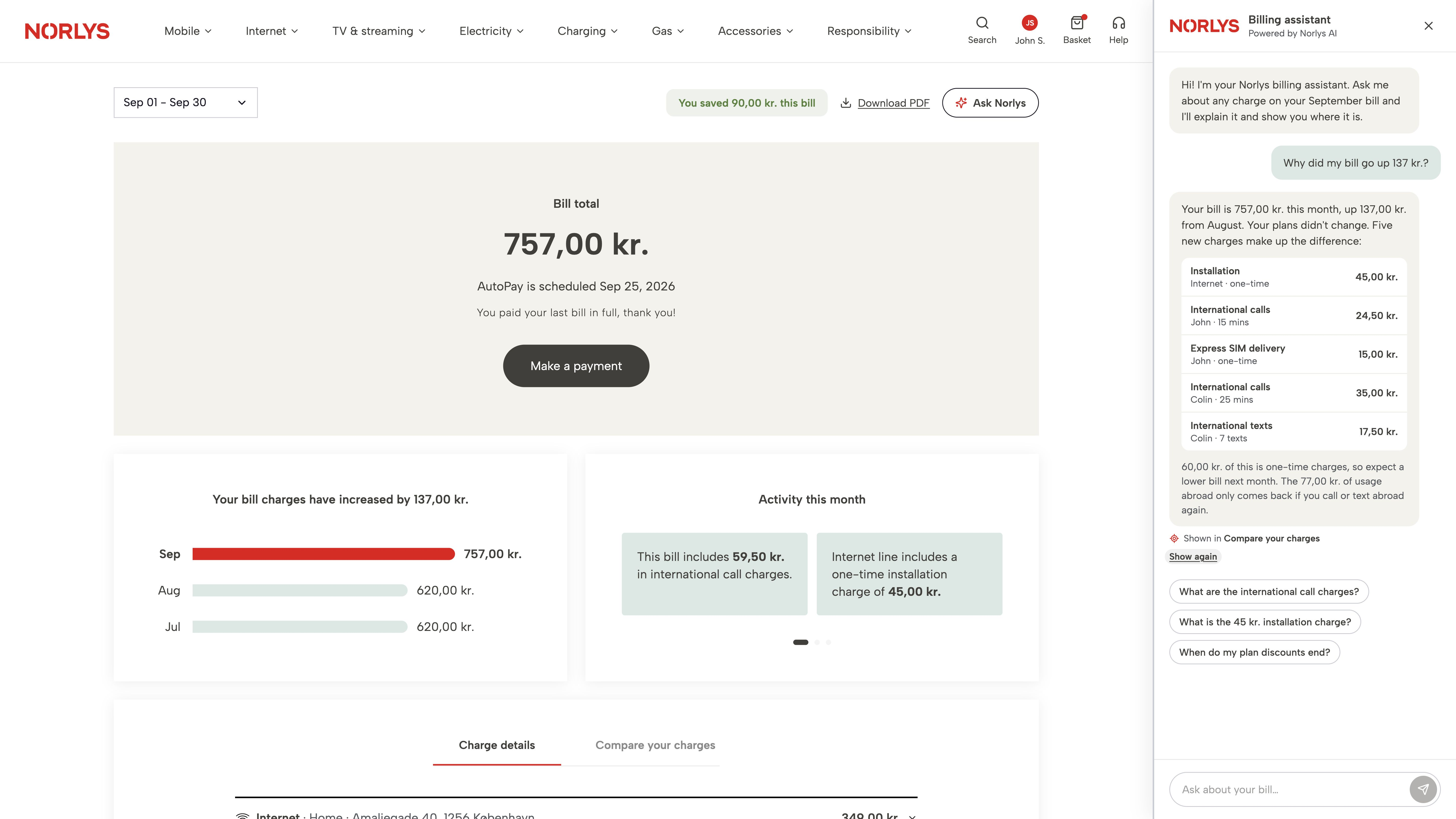
The original bill view is restored, with the conversation available to continue.
Decision 03
A billing explanation needs time to read. The demonstration uses a short loading state followed by a complete answer, rather than revealing words while the customer is trying to follow them.
The pace of guidance supports orientation. Movement settles before the relevant information is emphasised, and the emphasis fades gently. Text labels reinforce the visual treatment.
Keyboard controls, status announcements and reduced-motion behaviour were considered within the concept. These choices support a predictable experience and provide a basis for accessibility testing.
The conversation needed to remain useful across the wider billing experience.
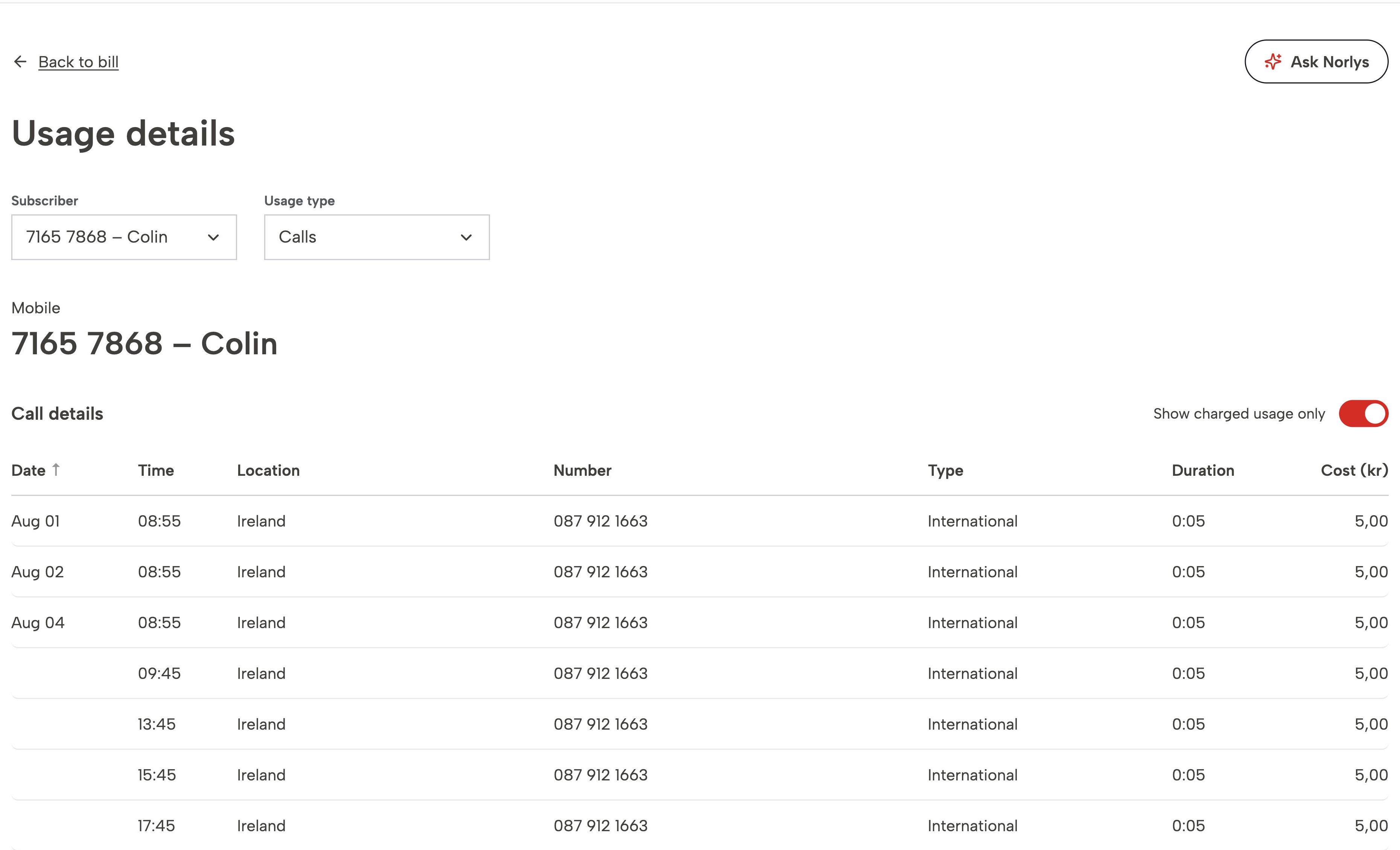
Moving from a summary to detailed usage should preserve the customer's question and the context around it. Keeping the conversation available supports that continuity, while clear destination labels help customers understand when they are changing views.
A route back completes the journey. Guidance should make the next step convenient without leaving the customer to reconstruct where they started.
On a phone, an open assistant can cover the very information it is trying to explain.
The mobile design changes the balance between conversation and bill during guidance. A smaller tray creates space for the relevant information, then expands again when the customer wants to continue the conversation.
The layout responds to the task: room to ask when reading the assistant, room to look when exploring the bill.
The concept brought a complete digital billing experience to Norlys, with AI as a new layer of convenience.
The presentation received a very positive response. Norlys was impressed by the bill design as well as the AI experience, according to the project feedback.
The work created a concrete way to discuss the future of billing: a clear digital bill with an assistant that could help customers explore it on their own terms.
The next step would be to put an unbranded version in front of real customers. Removing the brand would help explore their reaction to the experience itself, before introducing brand expectations.
I would test whether people choose the assistant, find the guidance useful and feel comfortable with how it changes the view. Comparing direct navigation with assisted navigation would help identify where AI adds convenience and where customers prefer familiar controls.
Task completion, perceived effort and confidence in the next step would provide a stronger basis for judging the experience than presentation feedback alone.
This project explored what billing could become when conversation sits alongside a complete digital experience.
The most consequential design change was giving the customer a choice before the assistant acted. The concept became more considered when capability was paired with predictable behaviour.
I would like to take an unbranded version to real customers next, to gauge their reaction and understand whether this kind of AI assistance fits how they want to manage their bills.